The Styling Note
Why this look
earns its place.
Fit, balance, colour, and context—explained for real-world wear.
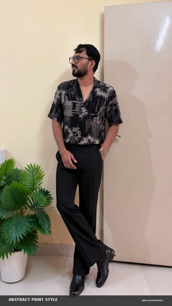
A black abstract printed shirt men wear when they want the premium look without the premium receipt is a specific trick: the print does the talking so the price tag never has to. In the photo the shirt is black with a white and grey abstract print, sunburst wheels, grids, broken geometry, on a short-sleeve camp collar cut, worn with black trousers and black Chelsea boots.
The whole outfit is monochrome, and that is why it reads expensive. Black on black forgives everything: fit imperfections, fabric weight, the price of every individual piece. The print is the only thing with anything to prove, and it proves it.
Why a black abstract printed shirt men rate so highly
Abstract prints on black have a built-in advantage: contrast without colour. White ink on black fabric gives the eye something to follow, but there is no colour story to clash with the trousers, the shoes, or the watch. You cannot mismatch what has no hue.
The sunburst and grid motifs matter too. Geometric abstracts read modern and deliberate; organic abstracts can read artsy in a way that needs a personality to back it up. Geometry is the safer abstract, and on a budget shirt, safer is smarter.
All black, but not flat
Monochrome only works when the textures disagree. Here the printed shirt plays against smooth black trousers and leather Chelsea boots, so the outfit has depth even though the palette does not. If the trousers were the same matte finish as the shirt, the whole thing would collapse into one dark shape.
The Chelsea boots are doing more work than they get credit for. A printed shirt is inherently casual; black leather boots drag it back toward sharp. Sneakers would have kept it in weekend territory. The boot is the piece that lets this outfit walk into a date or an evening plan without changing anything else.
Fit: the print forgives, the cut does not
A busy print hides a multitude of fit sins, which is part of why abstract shirts are such good value. But the shoulders still have to sit on the bone, and the body should skim rather than tent. The photo’s shirt is cut straight with room to move, which is the right call for a print this active.
Sleeve length on short sleeves wants to end around mid-bicep. Too long and the shirt reads borrowed; too short and the print crowds the shoulder. The camp collar should sit open and flat, not curl, which is worth checking before you buy because a curling collar ruins the neckline of an otherwise good shirt.
Where the premium illusion holds
Brunch, dates, evening plans, anywhere with dim light. Monochrome looks richer as the light drops, which is why this outfit punches above its price after sunset. In harsh daylight the print has to carry everything, and it still does, but the magic is weaker.
Accessorise like the photo: one watch, nothing else. A chain would fight the neckline print; bracelets would clutter the short sleeve. When the shirt is the outfit, the wrist gets one vote and the neck gets none. Even the watch should stay simple: a clean dial, a dark strap, nothing competing with the print.
Keeping black rich
Wash cold, inside out, with darks only. Black fades to charcoal faster than any colour, and a faded black printed shirt reads tired while a deep black one reads deliberate. Hang dry in shade; the dryer is where black goes to die grey.
The premium look was never about the price tag. It is about one print, one palette, and boots that mean it.
 MEN’S STYLE