The Styling Note
Why this look
earns its place.
Fit, balance, colour, and context—explained for real-world wear.
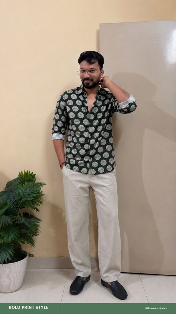
A green polka dot shirt men can wear without looking like a costume has to get the dot size right, and the one in the photo does. Deep forest green base, large cream medallion dots about the size of a coin, spaced evenly, on a full-sleeve shirt with the sleeves rolled to the elbow.
The dot size is the whole decision. Small polka dots read retro and fussy; these big bold dots read modern and confident. It is the difference between a shirt that winks and a shirt that stares, and this one stares.
Why this green polka dot shirt men notice works
Green is the underrated base for prints. It flatters most Indian skin tones better than navy or black, it pairs with neutrals without trying, and it photographs well, which matters more than anyone admits. The deep green here is dark enough to behave like a neutral and saturated enough to hold the dots.
The cream dots have a textured, almost hand-stamped look rather than flat printed circles. That imperfection keeps the pattern from reading mechanical. A perfect grid of perfect dots would look like wrapping paper; these have enough wobble to feel designed.
Rolled sleeves change the register
The sleeves in the photo are rolled to just below the elbow, and that single choice moves the shirt from formal to smart casual. A polka dot shirt with sleeves buttoned at the wrist would read dressy in a way the print cannot support; rolled sleeves admit the shirt is here to have a good time.
Roll them to the same height on both arms, with the cuff showing on the inside. Uneven rolls look like you got dressed in a hurry; matched rolls look like a decision. Two rolls, no more, or the sleeve bunches into a doughnut.
Grey trousers are the smart pairing
The light grey relaxed trousers in the photo are doing quiet, essential work. Green and grey are neighbours that never argue: the grey cools the green down and gives the dots a calm background to sit on. Beige would warm it up; dark denim would split the outfit. Grey is the diplomat.
Black loafers finish the bottom half with intent. Sneakers would drag the outfit toward casual; the loafer keeps the smart in smart casual. No socks or invisible socks, because the loafer wants a clean ankle line and the trouser break is already relaxed.
Where the dots belong
Weekend lunches, casual Fridays where the office allows it, evening plans, dates where you want one conversation starter built into the outfit. The dots give strangers something to comment on, which is either a feature or a bug depending on your personality.
Keep it out of interviews, client meetings, and anywhere the dress code is written down. A bold print is a bet, and bets belong where the stakes are social, not professional. It also works for casual Fridays in offices that allow prints, where the dots read as personality rather than rebellion.
Fit and care
The shirt is cut straight with room through the body, which suits a bold print: tight fabric would stretch the dots into ovals and give the game away. Shoulders on the bone, hem at mid-fly, placket flat. The collar should stand on its own without flopping, because a bold print with a limp collar looks like a hand-me-down.
Wash cold and inside out so the cream dots stay cream. Heat yellows light prints faster than the base colour fades, and yellowed dots on green look tired. Hang dry in shade and the contrast stays crisp.
Big dots are a commitment, but they are an easy one. One shirt, grey trousers, loafers, done.
 MEN’S STYLE