The Styling Note
Why this look
earns its place.
Fit, balance, colour, and context—explained for real-world wear.
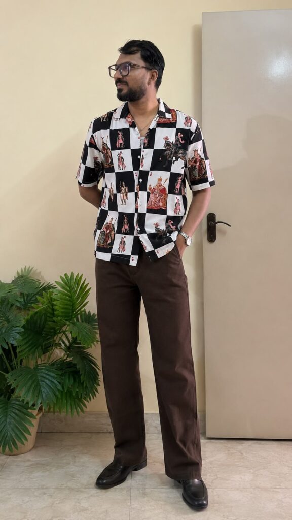
A playing card print shirt men can pull off is rarer than it sounds, because card prints usually go full Vegas. This one avoids that trap: a black-and-white checkerboard base with vintage king illustrations in red and gold on the white squares. The checks give the chaos a grid. The grid makes it wearable.
The playing card print shirt men see here is a Cuban-collar half-sleeve, worn with dark brown trousers and black loafers. One correction: this is not the black shirt the title describes. It is black and white in equal measure, and that balance is the whole styling brief. The outfit has to respect both colors.
Why the checkerboard works
Checks are structure. A card illustration floating on a solid black shirt would be a novelty; the same illustration locked inside a checkerboard reads as pattern. The black squares recede, the white squares carry the kings, and the eye gets rhythm instead of noise. It is busy, but it is organized busy.
The vintage styling of the illustrations helps. These are old-world kings, robes, crowns, horses, drawn like antique playing cards, not casino graphics. That aged quality keeps the shirt from reading gimmicky. Red and gold on white has a classic feel; neon would have killed it.
Styling a playing card print shirt men ground properly
Dark brown trousers, black loafers. The pictured pairing understands the assignment. The brown picks up the warmth of the gold and red illustrations; black trousers would have been the obvious choice and the boring one. Brown keeps the outfit warm where black would have made it stark.
Everything else goes quiet. One watch, no chains, no bracelets. The shirt has dozens of illustrations on it; it does not need a single additional detail. Plain belt, plain shoes, done. With statement prints, the shirt talks and everything else listens.
The tuck decision
With dark trousers and a bold top, a clean tuck sharpens the line between the two. Untucked works too, the straight hem is cut for it, but do not half-tuck a checkerboard. Asymmetric draping on a geometric print looks like a mistake, and the eye will find it instantly.
Where it fits
Evenings, parties, gigs, casual dates, anywhere with energy. This is a high-volume shirt; daylight and quiet rooms will make it feel loud. After dark, the black squares deepen and the white squares pop. Wear it where the lighting does half the work.
Buying it right
Check the check alignment at the placket and shoulders in the listing photos. Checkerboards that misalign at the buttons look cheap fast, and you will stare at that placket every time you wear it. The squares here line up, which is the sign of a print that was matched during cutting.
At this budget, bold prints are the best value in menswear. They deliver the most visual impact per rupee. Keep the wash gentle: cold, inside out, shade dry. The white squares are what fade first; protect them and the shirt keeps its punch.
The black loafers are the formal anchor the shirt needs. Sneakers would have made the checkerboard read streetwear; loafers pull it toward evening. With dark brown trousers, black shoes create a dark base that lets the white squares pop harder. The shoes are quiet, which is exactly what a loud shirt requires.
Look closely at the kings and you will see they are not identical repeats. Different poses, different robes, horses in some squares. That variety is what separates a designed print from a tiled pattern. Tiled repeats look manufactured; varied motifs look illustrated. It is the difference between wallpaper and art, and it is why this shirt survives close inspection.
 MEN’S STYLE