The Styling Note
Why this look
earns its place.
Fit, balance, colour, and context—explained for real-world wear.
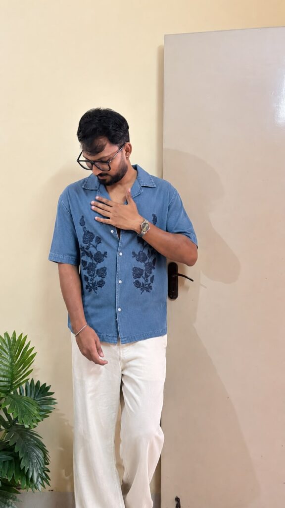
A blue embroidered shirt men notice in a lineup of plain blues is doing something most printed shirts cannot: the dark navy rose embroidery on this medium-blue base has actual texture. You can see the threadwork catching light on the chest panels. Drop-shoulder cut, short sleeves, spread collar, button placket. It is a quiet shirt with a loud skill.
The embroidery placement is the design. Two vertical panels of dark roses run down the front on either side of the placket, framing the buttons like a border. A blue embroidered shirt men wear with this kind of symmetrical placement gets a tailored feel for free. The symmetry reads as intentional in a way all-over prints never quite manage.
Embroidery versus print: why it matters
A print sits on the fabric; embroidery sits in it. That physical difference is visible from a few feet away: thread has shadow and dimension, ink does not. It is also why embroidered shirts photograph as more premium than printed ones at the same price. The camera picks up the texture even when the eye is still deciding.
The trade-off is care. Embroidery does not survive the abuse that prints shrug off. Wash this shirt inside out, cold, on gentle, and never wring it. The roses will stay crisp for years if you are gentle; one hot aggressive wash and the threadwork goes fuzzy and the shirt loses the exact thing that made it special. The premium look has a maintenance cost. Pay it.
Drop shoulders: the fit check that matters
Drop-shoulder cuts are forgiving by design, the seam sitting down the arm instead of on the shoulder bone, which gives the shirt its relaxed drape. But forgiving is not the same as anything-goes. On this shirt the drop is moderate: past the shoulder, not halfway to the elbow. That is the wearable zone. Push the drop further and the sleeve starts reading as a different garment.
The check is the sleeve opening. With your arms at your sides, the sleeve should end around mid-bicep and the opening should not gape. Drop-shoulder sleeves that hang too long expose the armpit from the side, which is the fastest way to make a relaxed shirt look sloppy. This shirt’s sleeve length is right, which keeps the relaxed cut reading as relaxed rather than oversized-by-accident.
Why cream trousers are the correct pairing
The photo pairs the shirt with cream wide-leg trousers, and the colour logic is sound: medium blue against cream is high contrast without being harsh, and the cream picks up nothing in the print, which is the point. The trousers stay neutral so the embroidery stays the star. White would work; beige would work; anything with colour would compete.
Footwear stays minimal here. The embroidery is already the detail; the shoes should not audition for a second one. Clean white sneakers, tan sandals, simple loafers: pick your lane and stay in it. Anything with heavy branding or loud colour at the feet pulls the eye down and wastes the roses.
College to casual: where a blue embroidered shirt men own fits
Daytime college, casual weekends, creative workplaces, evening plans that are not quite dates. The embroidery gives the shirt enough character to stand alone: no layering needed, no accessories required. It is a complete outfit in one piece, which is exactly what you want from a casual shirt.
It would not work tucked into formal trousers for an office; the drop shoulder and the roses would fight the formality. And it would be overdressed for the gym or a trek. Between those two poles, which is to say most of a young man’s actual life, it is one of the more versatile shirts you can own.
 MEN’S STYLE