The Styling Note
Why this look
earns its place.
Fit, balance, colour, and context—explained for real-world wear.
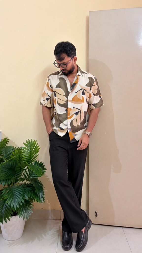
An abstract printed shirt men can wear without looking like they raided a holiday stall is a rarer thing than it should be. This one gets it right: big sweeping leaf shapes in olive, mustard and charcoal on an off-white base, short sleeves, a spread collar, and a cut that sits relaxed through the torso instead of billowing. It reads as a statement without reading as a costume.
The outfit in the photo does the smart thing and anchors the chaos. The shirt is tucked into black straight-leg trousers, which pull all that warm colour back down to earth, and black leather loafers finish it with a firmness the print needs. An abstract printed shirt men wear this way stops being the risky piece and becomes the piece the outfit is built around.
How to make an abstract printed shirt men keep reaching for work
The rule with a print this loud is that everything else goes quiet. Solid black trousers do that job here, but so would dark navy or charcoal. What does not work is a second print, or a trouser with texture that fights the shirt. Flat, dark, straight-leg bottoms are the move. Anything fussy turns the outfit into a negotiation.
Tucking is the other decision this outfit nails. With a bold abstract print, an untucked hem makes the shirt look two sizes too big and hides your waist completely. Tucked in, the print reads as deliberate. If the shirt is too long to tuck cleanly, get it hemmed; abstract prints at budget prices often run long because the cut is borrowed from an oversized block.
Why olive, mustard and charcoal beat brighter abstracts
Abstract prints fail when the colours fight each other. The olive and mustard here are close neighbours on the warm side, and the charcoal outlines give each shape a border so the colours never bleed into mud. That restraint is why the shirt works for brunch and date night, not just beach holidays. Brighter abstracts, turquoise, neon, candy pink, trap the shirt in vacation-only territory.
Skin tone matters too. Warm olive and mustard flatter medium to deep skin tones, which is exactly who this shirt is cut for. If you are very fair, this much warm colour near the face can wash you out, and a cooler abstract would serve you better. Buy the print that likes your skin, not the one that photographs well on someone else.
Fit rules for an oversized abstract shirt
Oversized does not mean shapeless. The shoulder seam on this shirt drops just past the shoulder bone, which is the sweet spot. Drop it further and the sleeve swallows your arm; keep it on the shoulder and you lose the relaxed line that makes the abstract print feel modern. When you try one on, lift your arms. If the whole shirt lifts off your torso like a tent, size down.
Sleeve length is the other check. Short sleeves on an oversized block should end mid-bicep, not at the elbow. Too long and the armhole hangs open and you flash everyone at the next table. The pictured shirt gets this right, which matters more than any styling choice: a wrong sleeve length makes even a good print look cheap.
Where an abstract printed shirt men wear actually fits
Brunch, day dates, gallery afternoons, casual Fridays in a creative office: anywhere the dress code is unwritten but observed. It is not an office-meeting shirt, and it is not a formal-dinner shirt. The spread collar keeps it one notch above a resort shirt, which is why the black loafers work. They signal that the print is a choice, not an accident.
For date night, keep the tuck, keep the loafers, add the watch. For brunch, you can untuck with relaxed chinos and clean white sneakers and let the shirt do the talking. One shirt, two temperatures, same rule every time: the print is the star, everything else is the stage crew.
 MEN’S STYLE